![tomis white.png]](https://support.tomis.tech/hs-fs/hubfs/tomis%20white.png?height=42&name=tomis%20white.png)
Chatbot Configuration
Customize your chat widget's design, messaging, and settings
You'll find this under Chatbot > Configuration in the left-hand navigation, across seven tabs: Appearance, Placement, Welcome Message, Personality, Transition to Human, and Install. This article covers Appearance through Transition to Human.

In this article:
- Appearance
- Placement
- Welcome Message
- Personality
- Transition to Human
Appearance
Customize how your chat widget looks, both open and closed.
Open Widget
These settings control what guests see once they've opened the chat widget.
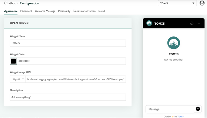
|
Field |
What it does |
|---|---|
|
Widget Name |
Your bot's display name, shown in the widget header and in the preview |
|
Widget Color |
The hex color used for your widget's header and accent elements |
|
Widget Image URL |
Your bot's avatar icon. The TOMIS team will store and upload this for you. |
|
Description |
A short tagline shown under the bot's name (e.g. “Ask me anything!”) |
Closed Widget
These settings control the launcher bubble guests see before they've opened the widget.
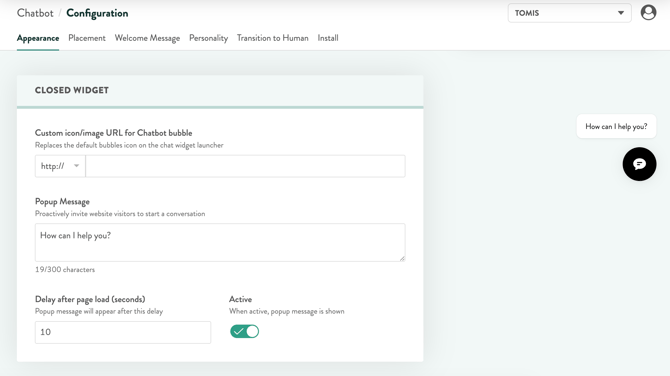
|
Field |
What it does |
|---|---|
|
Custom icon/image URL for Chatbot bubble |
Replaces the default bubble icon on the launcher |
|
Popup Message |
A proactive message that appears near the bubble to invite visitors to chat (up to 300 characters) |
|
Delay after page load (seconds) |
How long the page has been open before the popup appears |
|
Active |
Toggles the popup message on or off entirely |
NOTE: Don't forget to click Save Changes — it's easy to make an edit and navigate away before it's saved.
Placement
Control where your chat bubble appears on desktop and mobile.
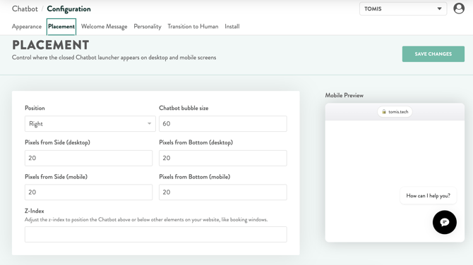
|
Field |
What it does |
|---|---|
|
Position |
Which side of the screen the bubble sits on (Left or Right) |
|
Chatbot bubble size |
The size of the launcher bubble, in pixels |
|
Pixels from Side (desktop) |
The bubble's distance from the side of the screen on desktop |
|
Pixels from Bottom (desktop) |
The bubble's distance from the bottom of the screen on desktop |
|
Pixels from Side (mobile) |
The bubble's distance from the side of the screen on mobile |
|
Pixels from Bottom (mobile) |
The bubble's distance from the bottom of the screen on mobile |
|
Z-Index |
Controls whether the bubble sits above or below other elements on your site, like a booking widget |
TIP: Use the Mobile Preview on the right to check your changes before saving — this is especially useful for making sure the bubble doesn't overlap a booking widget or footer element on mobile.
Welcome Message
Customize the message and quick reply buttons visitors see when they open your chat widget.
The Welcome Message
This is the first message guests see when they open your chat widget. Rich text is supported — you can bold, italicize, add bullet or numbered lists, and insert links. It has a 1,000 character limit.
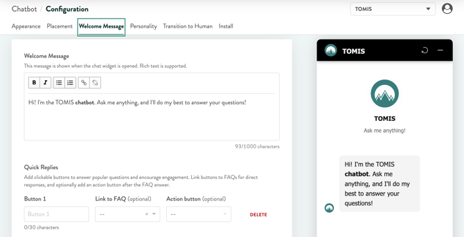
Quick Replies
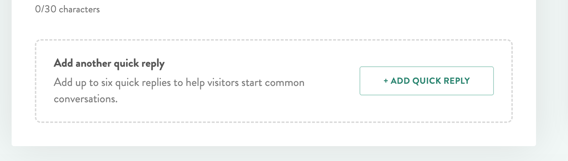
Add up to six clickable buttons below your welcome message to surface your most common questions right away. For each button you can set:
|
Field |
What it does |
|---|---|
|
Button |
The label guests see (e.g. “Alcohol Policy”) |
|
Link to FAQ (optional) |
The FAQ this button answers |
|
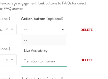
Action button (optional) |
An additional button (Live Availability or Transition to Human) that appears after the FAQ answer, to keep guests moving toward a booking or a human |
IMPORTANT: Any FAQ linked to a Quick Reply button is delivered fully scripted, exactly as written — no paraphrasing. This is the only place in the chatbot where that happens, so it's worth polishing these answers carefully, since they shape a guest's very first impression.
Personality
How your chatbot understands your business and communicates with guests.
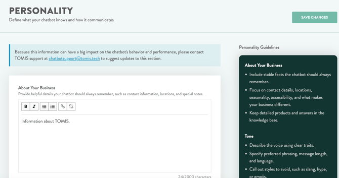
NOTE: This section is locked to protect your chatbot's behavior and performance — only the TOMIS team can make changes here. Want something updated? Email chatbotsupport@tomis.tech and we'll take care of it.
About Your Business
Stable facts the chatbot should always remember and will reference in the case of a Fallback Response. Detailed product and tour info lives in your Knowledge Base instead, not here. This information is loaded automatically from your Account Setup information but can be changed.
Tone
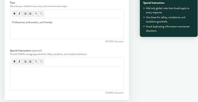
The voice and communication style your chatbot uses in every response — traits, preferred phrasing, message length, language, and any styles to avoid (like slang or hype). Limited to 500 characters.
Special Instructions (optional)
TOMIS-managed guardrails for safety, escalation, and compliance — things like how to handle booking questions, when to include links, and rules for staying accurate on policy-sensitive answers.
HAVE A CHANGE IN MIND: Reach out to chatbotsupport@tomis.tech any time, and we'll review and update it for you.
Transition to Human
Choose how your chatbot hands guests off to your team. Only one handoff method can be active at a time. However you configure it, the bot hands off automatically whenever a guest directly asks to speak with a person, or when it can't confidently understand or answer their question.
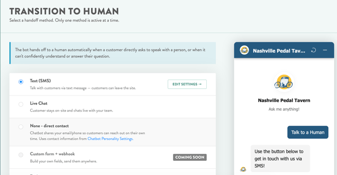
|
Method |
How it works |
Status |
|---|---|---|
|
Text (SMS) |
Guests leave their name, phone, and message; your team continues over text. Guests are free to leave your site. |
Available |
|
Live Chat |
Guests stay on your site and chat live with your team. |
Available |
|
None — Direct Contact |
The chatbot shares your email/phone (from the Personality tab) so guests can reach out on their own time. |
Available |
|
Custom form + webhook |
Build your own fields and send them anywhere. |
Coming Soon |
|
Zapier |
Push leads straight into your existing tools. |
Coming Soon |
Text (SMS) Settings
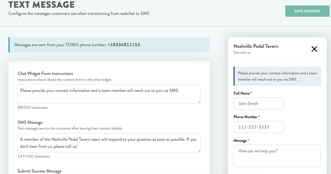
Messages send from your dedicated TOMIS phone number. Configure:
|
Field |
What it does |
|---|---|
|
Chat Widget Form Instructions |
Instructions shown above the contact form in the chat widget |
|
SMS Message |
The text message sent to the customer after they leave their contact details |
|
Submit Success Message |
The message shown in the chat widget after the customer submits the form |
Live Chat Settings
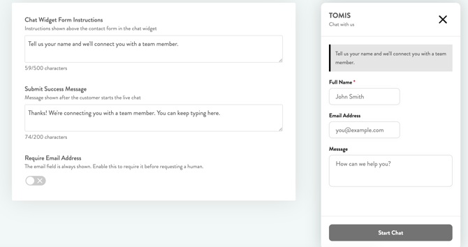
Configure:
|
Field |
What it does |
|---|---|
|
Chat Widget Form Instructions |
Instructions shown above the contact form in the chat widget |
|
Submit Success Message |
The message shown after the customer starts the live chat |
|
Require Email Address |
The email field is always shown; enable this to require it before requesting a human |
NOTE: Whichever method is active, click EDIT SETTINGS next to it to configure the specific messages guests see.